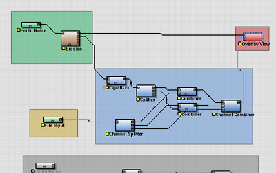
Although I’m leaving most UI changes till later, there are some that are simple yet surprisingly powerful.
For example, Functional Blocks (Groups):

The screenshot above is just from the rough implementation — blocks also are allowed to have text inside them, so that you can commentate on different sections of the network.
It seems stupid, but the ability to draw boxes around groups of devices to denote what “goes with” is shockingly helpful in understanding how a graph functions! This has been an idea to implement since the 0.99 days, but if I’d realized how cool it was earlier it would have gone in long ago.
10 replies on “UI Enhancements”
Hey, I find this a really useful feature. 🙂 Many times I wondered if there was a function to group devices together for a just better overview. Will it be only for the Professional edition?
This feature (like several other features currently being developed for Pro) will become part of the Standard and Basic editions.
However, Pro will be the first release containing it; after a bit of a delay while I figure out what I want to integrate into them, it will become part of the other editions as well.
heh! I do remember a sall discussion about it it back then, yes 😉 But if you had done it back then, it wouldn’t have looked as good, with those early simple device boxes 🙂
Very nice… certainly like the idea of having groups……….. 🙂
I see this being an asset in an enviroment where projects get shared, minor tweaking to suit a subset of a larger terrain would be alot easier with a commentary for the blocks functionality.
Very nice! I had no idea this was coming. Pleasantly surprised. 😀 It is indeed cool how a simple change can often have dramatic effects.
– Oshyan
I was thinking this would greatly help in isolating certain types of terrain elements… say one colored block has a complex mountain chain group and another block has a flattened plain group and so on for entire larger land elements over a huge blended tiled output………
Criss.. err, yes and no.. Note that if you start to have too much devices visible you will want to use more Macros to group devices in a smaller space. So, I really don’t know if these coloured blocks should be used “excessively”… On the other hand it would be nice to see the network inside the macro.. Hmm.. could a macro be turned into a “grouping” and back to a macro “on demand”?.. interesting idea..
Nice idea 🙂
imo, the higher level languages is where terrain apps need to start moving: higher levels of functional abstraction: macros, scripting, presets, qualitative interfaces (as oppposed to quantitative: numbers). This is one more example. I like Fil’s idea of group to macro to group- seems very natural.
monks
Thats true Fil… one does not need the clutter biulding up to such a great extent so i can understand that point about having to many loads of macros to a grouped area when constructing complicated terrains………….
A “Group Macro” now i like that idea very much…….. 🙂
So we can have a Group Macro/s… Open the group to reveal the complex additional macro/custom device connections inside the color box with the option of adding text, picture referances etc!