Over the last few posts, we’ve talked about how World Machine started, and the fact that the UI is a critical blocker. Last post, I introduced the new framework we’re moving to – QT.
As promised, I’m going to try to write more frequently about small bits of the work being done to move World Machine to the new framework.
So let’s start with something very simple – the left side toolbar.
Views are a changin’
In the old MFC framework, every button and objects on screen required that its location was set manually and specifically. You could use a visual editor for some items, but the resulting designs were brittle and couldn’t be resized easily.
We’ve moved on. In the web world, so-called “responsive design” is the norm – the idea that if I change the size of my display, the design should adapt to the space we have.
Luckily, QT defaults to something very similar with its concept of Layouts. You specify the contents you want and the constraints that you want to apply, and it will figure out where to place things.
This is a tremendous tool!
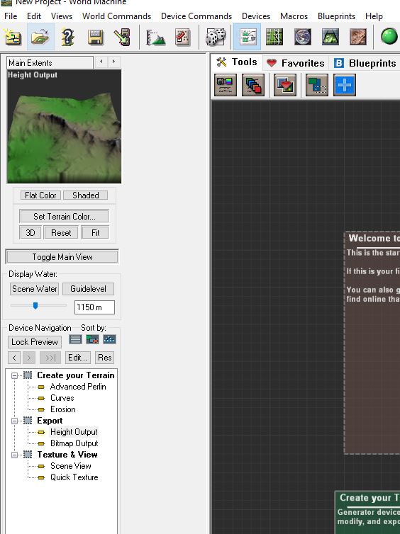
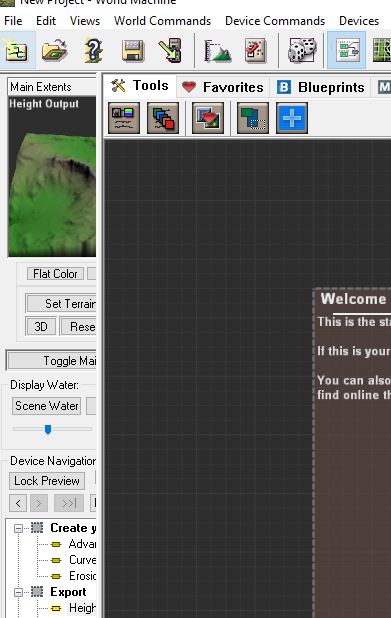
For example, let’s look at the left side toolbar. In the existing 3028 build, everything is hand-placed and hard-coded. You CAN resize the space allocated to the toolbar, but it doesn’t do anything useful..
This is almost certainly not what you want đ But manually adjusting all of the positions and sizes of the various elements on a resize is a very obnoxious chore.
Being able to make the leftarea bigger or smaller has been requested since the start. In QT, with minimal additional work, we get it for free:
We can now easily resize the left-side toolbar to get a bigger preview, and all of the buttons and elements resize and re-position themselves in response. This is particularly powerful in combination with the new high-def previews that occur – but we’ll talk about those in another post đ
Until next time!
Stephen
Hmm, why not decouple the preview window and make it float as an option? That way you wouldnât need to resize the entire sidebar (and save screenspace) if all you need is a bigger preview window. Just a thoughtâŚ
Absolutely! Thatâs a good idea; and with QT itâs pretty straightforward to implement. Iâd like all of the major UI âsectionsâ to be breakable/drag-able so you can configure everything about the views the way you want them.
However⌠that can come later.
The primary focus right now is to keep things as simple as possible to make the conversion to LTE happen quickly. I havenât always been succeeding at this But Iâm trying to incorporate only the easiest UI changes/wins for now.
âevery button and objects on screen required that its location was set manually and specificallyâ WHAT!!!
That must be bad , That can not be goodâŚ
Fortunately we have QT nowâŚ
Luve that new resize window feature!! WTG
Honestly, I still dont see any value in this. This is tremendous rework with not much added value. I had never ever problem with WM GUI. And I am user for cca 6 years. Could be better, for sure, but it does its job. On the other side, there are other areas, which are pain in the as. As artist, I need to iterate fast. If any adjustment takes 2 minutes to know result, it limits my productivity. With just 2x better speed, I could by very often twice as productive, this would be HUGE. So logical step would be GPU support (start migrate at least part of the load to GPU). There are GPU driven tools on the market, so it is definitelly possible (I still consider WM the best by far). Other major pain is texturing/coloring. Quite hard to achieve realistic look, for terrains with more climas. This could be solved by library of various presets, macros, etc⌠There are also some useful features missing, like dune filter. I think Geoglyph showed, what artists are really missing (pitty it does not support WM anymore, I missing it a lot) and just taking it as inspiration and go this way would make much, much more sense. I understand, that for you as developer is GUI pain in the ass, but for me as user I didnt care about GUI at all, there was no bottleneck for me. Productivity (time spent) is what allows me to earn my bread. Making some device configuration takes minutes. It takes hours of iterations to tune it.
Demostenes,
I hear you. Although I do think the UI and UX is very important, productivity and functionality is definitely #1. LTE will certainly look nicer, but that is a minor benefit compared to the absolutely game-changing productivity improvements it will usher in! Iâll talk about this a lot more in the next blog post. It is the thing Iâm absolutely most excited about.
The short version is that the combination of a profoundly new architecture for project state and QT for UI fixes/shortens a lot of the tweak/tune cycle that consumes so much time creating worlds right now. I think youâll love it, but let me know in the next post